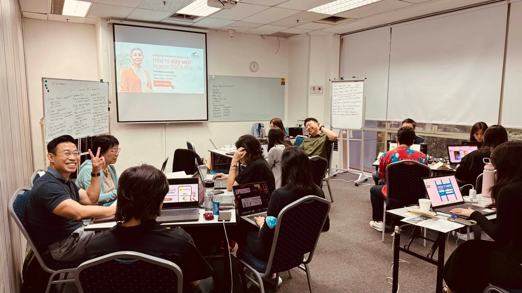
Small classes, better learning
We recommend 10 to 15 participants, and cap every run at 20. These are hands-on workshops — above twenty we can no longer get round the room, look at each person’s screen and fix the actual problem, which is the whole point of coming. Public runs are capped at 10.
Our office @ Raffles Place
- Where every public run is held
- Central, and close to Raffles Place MRT
- Capped at 10, so nobody gets lost at the back
A larger venue, or your own office
- External venues include Paya Lebar Square and the Synergy Room at 190 Clemenceau Avenue, subject to availability
- Or we come to you, which most corporate clients prefer
- Please give us 30 days’ notice for an on-site run, so the room and equipment can be sorted
One shared language for making design work — and for critiquing it.
Most teams have no shortage of opinions about a design. What they lack is a shared vocabulary for them. Feedback arrives as “make it pop”, “it feels off” or “can the logo be bigger” — and the person who made it is left guessing while the revision rounds multiply.
DesignSync treats creation and critique as one skill rather than two. Participants work through the principles that make a layout hold together — balance, alignment, emphasis, proportion, movement, repetition, contrast and unity — alongside the colour and typographic choices that signal meaning before anyone reads a word. They then learn to turn those same principles into feedback: specific, actionable, and argued against the communication objective rather than personal taste.
The workshop was designed and delivered as a customised in-house programme for SingHealth, using the team’s own public health communications as the working material. It can be contextualised the same way for any team that creates and reviews visual communications in-house.
- Communications, marketing and corporate affairs teams producing visual materials in-house
- Non-designers who brief, review or approve design work
- Designers and content creators who want their critique sessions to go better
- Teams where a simple piece of artwork takes too many rounds to sign off
- Anyone producing public-facing posters, social posts, infographics or EDMs
- Evaluate a layout against balance, alignment, emphasis, proportion, movement, repetition, contrast and unity
- Use colour and typography deliberately, knowing what each signals to an audience
- Judge a design against its communication objective and audience rather than personal preference
- Give structured design feedback that the person who made it can act on
- Receive critique without defensiveness, and use it to improve the piece
- Run a critique session that ends in decisions instead of more opinions
What we cover
| Module 1 | What Makes a Design Work The eight principles that decide whether a layout holds together: balance, alignment, emphasis, proportion, movement, repetition, contrast and unity. Reading a piece the way an audience reads it — what the eye lands on first, second, and never. Separating what is wrong with a design from what is merely unfamiliar. Activity: audit a real piece of your own material against all eight principles. | 75 min |
|---|---|---|
| Module 2 | Colour, Type and What They Signal What colours carry before a word is read, and how that changes by context and audience. Building a readable type hierarchy. Title length, font size and keyword placement. Holding brand consistency without making everything identical. Activity: re-colour and re-set an existing piece for a different audience, then justify the choices. | 60 min |
| Module 3 | Design With a Job To Do Objective, audience and call to action, settled before the first layout. The practical checklist — image sizing, title treatment, keywords, thumbnail, call to action, branding. Why most weak design is a briefing problem rather than a craft problem. Activity: write a proper brief for a piece your team is about to produce. | 60 min |
| Module 4 | The Language of Critique Describing what you see before stating what you want. Separating taste from judgement. Tying every comment back to the objective and the audience. Turning “it feels off” into something the designer can act on. How to disagree with a decision without relitigating the brief. Activity: rewrite a set of real, vague feedback into specific, actionable notes. | 75 min |
| Module 5 | Running a Critique That Ends in Decisions Structure, roles and timeboxing. Who speaks, in what order, and who decides. Recording what was agreed so it is not reopened next week. Handling conflicting feedback from stakeholders, and getting to sign-off. Activity: run a full critique round on the group’s own work, to the agreed structure. | 90 min |
Outline shown for the one-day format. Content and examples are contextualised to your organisation’s own materials.
Participants work on their own team’s non-confidential materials, so the critique practice is real rather than hypothetical. Bring a laptop and two or three recent pieces — a poster, an EDM, a social post. We review your brand guidelines beforehand and build the examples around the work your team actually produces.

Charmaine Lee
Charmaine Lee is an ACTA-certified trainer registered under TAEPP (AE250000925) with over 16 years of digital marketing experience and more than 4,500 learners trained. She specialises in practical, hands-on training in visual design, Canva, digital content creation, storytelling, presentations and generative AI. She also develops vocational curricula and supports educator training through international education initiatives.
LinkedInBring this programme to your team
- Formats1 day
- DeliveryOn-site
- Group size12–25 people
- LevelNo design experience needed
Fees are quoted per group, based on format and size.
Inside a workshop
A short look at how our sessions run: less lecture, more making.